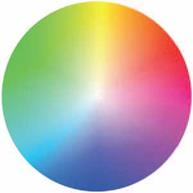
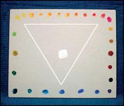
A color wheel in this true form gives the artist a tool to create different hues and to shade them to neutral darks. The Makeup Artist would take this one step further by considering what colors also would work under different conditions: lights, color corrections, color grading, and so forth. The following will give you the basic language used to decipher the blending of hues.
To begin to understand how to use the color wheel, it is important to know where to start.
On the RCW, the colors on the outside of the wheel are pure hues. What you can add to alter these colors is a tint with white, a tone with white and the complement color, or a shade with just the complement color. This will determine the final outcome of that color, including the addition of analogous relationships next to each other on the wheel. Always start matching or plotting a pure color from the outside of the color wheel—this is the pure hue. Finding the correct color or area of color, you can decide where to go from there. For example, if you want to find the complement of the color that you have already plotted, go to the opposite side of the color wheel. You will know the color will work. You can then tint, tone, or shade that hue to get the desired effect.
 |
|
Hue: Any color.
Primary Color (Figure 3.2): There are three primary colors. They can be mixed together to make all other colors. Transparent Yellow is PY 150 or PY 153. Transparent Magenta is PR 122. Transparent Cyan is PB 15.
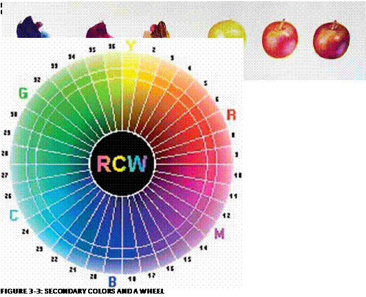
Secondary Colors (Figure 3.3): Colors that are made by mixing together two primary colors.
Red: Made by mixing yellow and magenta.
Blue: A combination of magenta and cyan.
|
FIGURE 3-4: A TINTS COLOR WHEEL |
Green: A mixture of cyan and yellow.
Tints (Figure 3.4): Made by adding white to any hue.
Dual Tone: A pigment that changes hue from mass tone to top tone. In other words, a color that changes as it gets lighter—not just in value, but in its actual color. For example, a brown color that changes to a bright yellow color is a dual tone. Purple that changes from a cool dark to a warm light is a dual tone.
Top Tone: Adding white to a color.
Mass Tone: Color right out of the tube or pure powder pigment.
Undertone: Adding clear media
Transparent: Dyes are clear—you can see through transparent dyes.
Translucent: Milk is translucent—it can never be transparent by adding a clear medium.
Opaque: Dense, like a small rock—it cannot be seen through.
|
FIGURE 3-5: A BLACK & WHITE SCALE |
|
FIGURE 3-6: DOTS OF COLOR |
Classic color schemes will help you to decipher which way to plot a color on the color wheel.
Monochromatic (Figure 3.5): Any one color mixed with white.
Analogous (Figure 3.6): Colors next to each other on the color wheel—for example, orange and red or yellow, orange and red, or cyan and green.
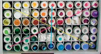
Complementary (Figure 3.7): Any colors 180 degrees apart on a 360-degree wheel.
Triadic: Any three colors that are 120 degrees apart on the wheel, usually primary colors.
Split complementary colors are formed like a Y on the color wheel—one color on each side of a complementary color.
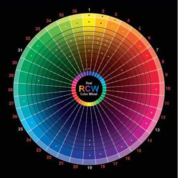
FIGURE 3-7: RCW WHEEL
Opposition, or complementary, pigments make neutral darks. If you mix two opposite pigments, the color will result in a darker hue. This enables the Makeup Artist to work with darker pigments without using black.
It is also a great way to mix pre-existing makeup when you want to form a darker shade. Because the pigments complement each other, there will be a natural look to your work. The darker pigments will not clash against the skin tone of the person you are working on.
The following outlines the six opposition colors and the neutral darks they will generate.
• Cadmium Yellow Light and Cadmium Yellow Medium are opposite Ultramarine
FIGURE 3-8: CADMIUM YELLOW LIGHT, CADMIUM YELLOW MEDIUM, ULTRAMARINE BLUE
Blue (Figure 3.8). Notice that yellow darkens to brown. Brown and ultramarine make the neutral dark.
• Cadmium Orange is opposite Cobalt Blue (Figure 3.9).
• Burnt Sienna (Figure 3.10), which is a dark orange, is opposite Cobalt Blue.
• Opaque Cadmium Red Light and Red Dark are opposite Cyan (Figure 3.11). Cyan is also called Thalo Blue.
• Quinacridone Magenta Transparent PR122 is opposite Thalo Green (Figure
3.12) .
• Purple is opposite Yellow Green (Figure
3.13) . Green Oxide Opaque is a dark
yellow green to be used as the opposition color.
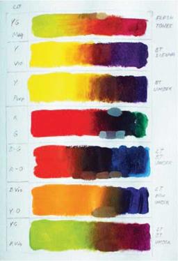
The chart in Figure 3.14 illustrates how you can combine pigments to produce browns.
The chart will also show you how to mix pigments that will give you cool browns or warm browns. Brown neutral tones in
|
|
||
|
|||
|
|||
|
|||
FIGURE 3-12: QUINACRIDONE MAGENTA TRANS. PR:122 AND THALO GREEN
![]()
are colors used to get skin tones. Colors from yellow to red all darken to brown, either by adding brown or by mixing brown. All skin colors have a range of 10 tints and 10 darks for each of the seven colors. To make a skin tone lighter, you will take the color already plotted and lighten it with white or yellow. To make a skin tone darker, you will take the color already plotted and darken with browns and the complement color. The Makeup Artist can also change existing foundations or mix your own by using the color wheel.
Usages and combinations of color greatly affect your final makeup application (Figure 3.15).
You will also need to address the undertones in the skin, eyes, and lips. Color can balance, conceal, correct, or show emotion. Example: If there is too much red in the face, you can apply a green or yellow under or over the foundation to neutralize the red.
|
You need to understand how colors function in relation to makeup artistry.
Red is one of the secondary colors. Magenta is a primary color. The complementary color to red is cyan. Red is made by mixing yellow and magenta. A cool cherry red (RCW #12.6.5) will bring life into a darker cool skin tone, but only if the skin tone is cool as well. Orange red will give a healthy glow to golden skin. Red is also used in makeup effects to show sun damage, alcohol abuse, windburn, crying, skin lesions and rashes, bruising and trauma to the skin, and to neutralize any gray undertones in appliances, and tattoo cover-up.
Blue is a secondary color. The complement to blue is yellow. Cyan is a primary color. Blue is a combination of magenta and cyan. Blue will work with most skin tones. Blue and shades of blue should not be used for bluescreen work—it will disappear. Blue can be used in makeup to portray illness, death, cold, and freezing, as well as bruising of the skin.
Yellow is a primary color. The complementary color to yellow is blue. Yellow is used to add warmth to other colors. Yellow browns (gold) in eye shadows, blushers, and lipsticks flatter golden skin tones. In makeup, yellow can be use to portray illness, weakness, rotting, and bruising.
Green is a secondary color. Green is a combination of cyan and yellow. The complement color to green is magenta.
Green can be cool (blue green) or warm (yellow green). In makeup, green is used to
neutralize reds (for example, to tone down ruddy skin tone or broken capillaries in the face). Warm greens (with yellow added) look good on golden tones, or golden skin tones. Cool greens (with cyan or blue added) look good on cool tones, or skin with cool undertones. Green is also used in bruising and to portray illness, cold, or rotting. Green is also used to cover tattoos.
Green or shades of green should not be used in greenscreen work—anything green becomes invisible.
Orange is a warm color that is between
43
yellow and red on the RCW. The
complementary color to orange is halfway between cyan and blue, called Cobalt Blue (RCW #22). Orange is a vibrant color that can be used as a highlighter on warm and dark skin tones.
Orange is a good color to use for masking out blue, as in beard stubble and covering tattoos. Orange also will neutralize blue undertones (or blue lighting) in dark skin tones.
Violet (RCW #14) is the color between purple and magenta. Violet is a cool color.
The complementary color to violet is chartreuse. Violet is used to correct too much yellow or shallowness in skin tone.
Most cool skin tones look good in the color violet. In makeup, violet and combinations of violet are used for bruising, wounds, freezing, and death.
Pink is red with tint (white) added. There is a warm pink, which is a light red, and a cool pink, which is magenta. Pink is flattering to most skin tones. Magenta pink is good on cool skin tones. Warm pink
![]()
(with golden tones added) looks good on warm skin tones. In makeup, pink is used in eye shadows, lipsticks, and blushers to show good health.
Black is often used to darken another color and make a shade of that color. Shading colors can also be made by mixing opposite colors together. Black mixed with white makes a neutral gray. Cool, darker skin tones tend to look good in black. In makeup, black is used in eye shadows, eyeliners, brow color, and mascara. Black can be used to add drama or depth to existing colors.
White is added to other colors to make tints. In makeup, white or off-white can be used as highlighters, or to make darker colors stand out. Cool, darker skin tones tend to look good in white.

